Color psychology isn’t just a fundamental aspect of design; it’s a pivotal force in shaping the effectiveness of conversion rate optimization (CRO). This segment introduces the “Hidden Gem in Conversion Rate Optimization,” highlighting its significance in influencing consumer behavior and decision-making processes.
Discover how color psychology may dramatically improve your website’s conversion rates. Discover how smart color usage may improve user experience, impact purchase choices, and boost your brand’s digital visibility.
Color Psychology in CRO: The Delicate Science Behind it
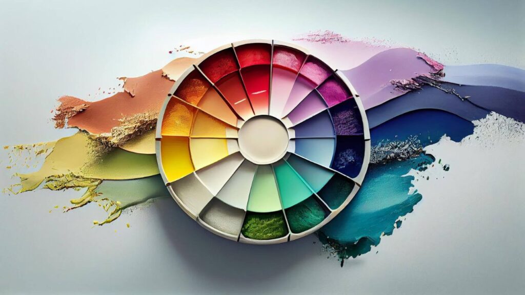
In the domain of Conversion Rate Optimization, the “Hidden Gem in Conversion Rate Optimization” lies in the power of colors. Colors do more than fill space—they evoke emotions, influence perceptions, and even drive actions. By understanding and leveraging the emotional and psychological responses that colors evoke, brands can significantly enhance their user experience, improve engagement, and boost conversion rates. This section delves into the psychological effects of colors, exploring how different hues can affect mood and behavior, and how these insights apply to various demographics.
Emotional Responses to Colors
Each color evokes different emotions and reactions. Selecting the right color involves understanding the emotional landscape of your target audience. For instance, blue is often associated with trust and serenity, making it a popular choice for financial institutions and healthcare websites. On the other hand, red is linked to excitement and urgency, which is why it’s frequently used in call-to-action (CTA) buttons and sale announcements.
Color Psychology and how AAA companies use it for Branding
The “Hidden Gem in Conversion Rate Optimization” lies within the realm of color psychology, particularly in branding. The role of color in branding cannot be overstated. From establishing a brand identity to setting the tone for customer interactions, color choices play a crucial role.
The choice of color in branding can set the tone for your entire business. A well-chosen color scheme can convey your brand’s personality and values without a word being spoken.
Through real-world examples, this part examines how brands have successfully leveraged color psychology to resonate with their audience.
Case Study: Coca-Cola
Consider Coca-Cola’s iconic red. It’s vibrant and eye-catching, reflecting energy and passion, which aligns perfectly with the brand’s message of happiness and togetherness.
Case Study: Starbucks
Starbucks uses a calming shade of green, emphasizing its commitment to sustainability and relaxation amidst the hustle and bustle of daily life.
Optimizing Website Colors for Conversion
Ah, the psychology of colors in web design—now that’s a fascinating topic! It’s like opening a box of crayons and realizing each color has its personality, affecting our decisions and emotions in subtle yet powerful ways. When it comes to web design, this color play becomes a pivotal element in creating user experiences that are not just visually appealing but also emotionally resonant.

Choosing the right color scheme for your website is more art than science. The right color scheme can enhance user experience, reduce bounce rates, and increase website engagement. This can be done through the process of analyzing and optimizing their website’s color palette, and A/B testing for color choices and finding the best match. It’s not just about aesthetics; it’s about creating an environment that aligns with your audience’s expectations and emotions.
A/B Testing for Color Choices
emphasizing the importance of A/B testing to identify the most effective hues for conversion. A/B testing different color schemes and elements can reveal what resonates best with your audience, allowing for data-driven decisions that boost conversion rates.
Colors and Call-to-Action Buttons
CTAs are the climax of conversion efforts, representing the “Hidden Gem in Conversion Rate Optimization.” The colors you choose can either propel users to take action or deter them. Imagine you’re browsing a website, and there it is—a call-to-action (CTA) button, like a beacon of light guiding you on what to do next.
The color of this button is no random choice. It’s a carefully considered decision that taps into our psychological wiring, influencing how we feel and react. For example, a red button can evoke feelings of urgency and excitement, making us more inclined to click on a “Buy Now” or “Sign Up” call.
On the other hand, a blue button might evoke trust and reliability, perfect for something that requires a bit of contemplation, like signing up for a newsletter.
But it’s not just about picking a color that looks nice. The color needs to stand out from the rest of the website in a way that catches the eye without clashing with the overall design. This is where the magic of contrast comes in. A bright, contrasting color against a muted background can make a CTA button pop, drawing the user’s attention almost magnetically.
And here’s where it gets even more interesting: the choice of color can also depend on the target audience. Cultural differences, age, and gender can influence how colors are perceived. For instance, while orange might be seen as fun and youthful, appealing to a younger audience, a more conservative audience might prefer blue or green, which convey stability and peace.
The Psychology of Color in E-commerce
Trends in color psychology can offer new opportunities for conversion rate optimization.
In the realm of e-commerce, color psychology can significantly impact shopping behaviors. Imagine you’re shopping for a new yoga mat. You land on a site with a green and earthy color scheme. Instantly, you feel a sense of calm and connection to nature, aligning perfectly with the eco-conscious ethos of the product. The color choice here is no accident; it’s designed to resonate with the target audience’s values and aesthetic preferences.
Or consider the checkout process on an online store. A study found that color can impact shopping behavior, with red buttons sometimes outperforming green ones, despite green typically being associated with “go” or “proceed.” This illustrates that context and audience preferences play crucial roles in how color affects decision-making.
The Impact of Color
First off, colors have the unique ability to evoke emotions, convey messages, and set the mood — all without saying a word. For instance:
- Red is often associated with energy, excitement, and passion. It’s a color that can create a sense of urgency, making it ideal for clearance sales or call-to-action buttons like “Buy Now” or “Sale Ends Soon.” However, use it sparingly; too much red can be overwhelming or signal danger.
- Blue is the calming counterpoint to red’s intensity. It evokes trust, security, and reliability, making it a favorite for banks and tech companies. In e-commerce, blue can help create a sense of trustworthiness and dependability around a brand or product.
- Green is versatile; it represents nature, health, and tranquility but also wealth and prestige. It’s perfect for eco-friendly products or sites emphasizing sustainability. Plus, green is easy on the eyes, making it great for ‘Add to Cart’ buttons or backgrounds.
- Yellow and orange are cheerful, optimistic colors. They can stimulate feelings of happiness and enthusiasm but need to be used judiciously as they can also signify caution or induce anxiety if overused.
- Black exudes sophistication, elegance, and luxury. It’s often used for high-end products and luxury brands to convey a sense of exclusivity and value.
Color Preferences and Gender
Color preferences can vary significantly across genders, with women generally favoring softer hues and men preferring bolder shades. This insight is invaluable for you when targeting your specific demographics, allowing you to tailor your color schemes accordingly.
Landing Page Optimization with Colors
Diving into the world of color psychology in Landing Page Optimization (LPO) is like unlocking a secret weapon that can seriously amp up your conversion rates. Let’s break it down in a way that’s as colorful as a painter’s palette:
| Color | Emotion/Effect | Ideal for |
| Blue | Trust, Security | Financial services, Tech Companies |
| Red | Urgency, Excitement | Sales, CTA buttons |
| Green | Health, Growth | Wellness, Eco-friendly products |
| Orange | Fun, Friendliness | CTAs, Subscription services |
Utilizing color psychology smartly can turn your landing page into a conversion machine. It’s not just about making things look pretty; it’s about tapping into the emotions and psychological triggers of your visitors. Want them to feel secure? Splash some blue. Need to create a sense of urgency? Red’s your color. Looking to appeal to the health-conscious or eco-friendly crowd? Go green. And for an approachable, fun vibe, orange will do the trick.
Psychological Effects of Colors in Digital Marketing
Let’s look at some eye-opening facts that significantly impact consumer behavior and marketing strategies. For starters, it’s intriguing to note that individuals often make subconscious decisions about a product within the first 90 seconds of viewing, with a whopping 90% of their assessment based on color alone.
This powerful influence of color extends to advertising, where full-color ads are recognized 26% more often than their black-and-white counterparts.
When it comes to business and digital marketing, the strategic use of colors can have a profound effect on conversion rates. An overwhelming majority of professionals believe that colors not only present an image of impressive quality (92%) but also aid in attracting new customers (90%) and enhancing brand recall (90%).
Additionally, colors are thought to convey success (83%), provide a competitive edge (81%), and even make businesses appear larger to clients (76%).
Color preferences also play a crucial role in purchasing decisions, especially for big-ticket items like large appliances, which two-thirds of consumers won’t buy if it’s not in their preferred color. 85% of shoppers cite color as a primary reason for their purchase choices, underscoring its significance in consumer preferences and brand perception.
Remarkably, color can boost brand recognition by up to 80%, directly linking to consumer confidence. Color preferences also play a crucial role in purchasing decisions, especially for big-ticket items like large appliances, which two-thirds of consumers won’t buy if it’s not in their preferred color. 85% of shoppers cite color as a primary reason for their purchase choices, underscoring its significance in consumer preferences and brand perception.
This deep dive into color psychology underscores the powerful role colors play in marketing and consumer behavior, highlighting how strategic color choices can enhance brand perception, attract customers, and drive sales.
Conclusion
In e-commerce, the psychology of color is about more than just making a site look pretty. It’s about strategic choices that align with brand identity, resonate with the target audience, and guide them toward making a purchase. The “Hidden Gem in Conversion Rate Optimization” lies in the hidden power of color psychology, which is both vast and nuanced. A/B testing different colors for various elements (like buttons, backgrounds, and call-to-action texts) can provide valuable insights into what works best for a particular audience.
Ultimately, understanding and applying the principles of color psychology can create a more engaging and effective e-commerce experience, leading to increased satisfaction for shoppers and better results for businesses. It’s a colorful world out there, and in the realm of online shopping, the right palette can indeed make all the difference.
Frequently Asked Questions (FAQs)
Can the color of a website really influence conversion rates?
Yes, the color of a website can significantly influence conversion rates by affecting visitor emotions and behaviors.
How do I choose the right colors for my brand?
Choose colors that align with your brand identity, appeal to your target audience, and stand out from competitors.
Are certain colors better for call-to-action buttons?
Yes, colors that contrast with the website’s color scheme, such as red or orange, can enhance the visibility and effectiveness of CTA buttons.
Can color preferences vary based on gender?
Yes, color preferences can differ significantly between genders, influencing marketing strategies and color selection.