
The Client’s Challenge
The client’s website, like many others, displayed the add-to-cart button only when users hovered over a product image. Our intuition said there’s room to
grow here.
Crafting the Hypothesis
We hypothesised that keeping the add-to-cart button visible at all times, rather than just on hover, would simplify the user journey. The idea was to reduce the number of steps and make the path to purchase more straightforward and accessible.
Implementing the Test

To test our theory, we set up an A/B test. The control group saw the standard hover-triggered add-to-cart button, while the test group experienced a new version where the add-to-cart button was always in sight.
Results
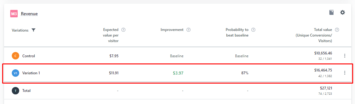
In 2 weeks we saw a statistically significant result. The always-visible add-to-cart button led to a significant 26.83% increase in conversion rates. In terms of revenue, this meant an additional $5,417 over two weeks. Projected monthly, this equates to $10,834, and over $130,000/year.
Takeaways
This case study highlights a crucial aspect of e-commerce – the importance of friction reduction in the customer journey. A small, seemingly simple change in the interface can have a profound impact on shopping behaviour and overall sales.